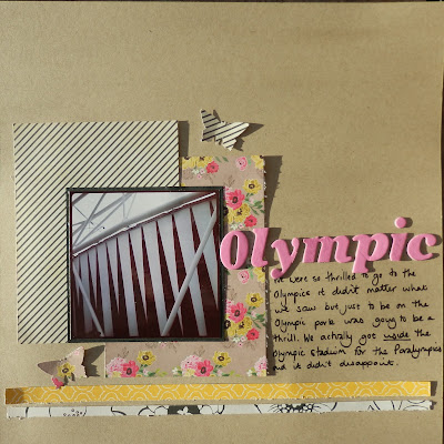
both of these LOs were made using the recent sketch at Sarah's Cards. the bottom one is my favourite I think.
the top one is a close up of the Olympic Stadium. I think the striped paper mirrors the pattern of the stadium nicely.
this one is quite typical of me. I take some bad photos but I don't delete them I quite often print them out and use them on a page. this one Nancy got too close so she's blurred in the picture but I love the natural smile.
here is the sketch


totally agree about using 'less than perfect photos' the photo may not be perfect but the smile is!! Two beautiful layouts!
ReplyDeleteAgree about the photos and smile! Fantastic layouts. :)
ReplyDeleteVanessa
Gorgeous layouts Karen. I love all the details on the second one.
ReplyDeleteTracy. x
Love the tags and the colour scheme of the second page. Thanks for taking part in our challenge :D
ReplyDeleteI often take photos on my phone which don't come out perfect, but capture a perfect moment - I use them on LO's all the time :) Thanks for joining in :)
ReplyDelete